

Engini’s Dashboard
The Dashboard is your main operations hub. It offers a bird’s-eye view of your account’s health, data usage, and automation success rates over any selected timeframe, up to 120 days back.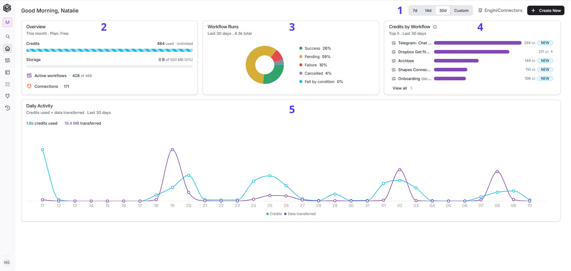
Time Filter & Quick Actions
Located at the top right of your screen, these controls let you manage how you view your data:- Time Filters (7d, 14d, 30d, Custom): Change the date range with a single click to update all graphs and statistics simultaneously.
-
+ Create New : A permanent shortcut that allows you to instantly build a new Workflow.new table, set up a new connection from anywhere in the app and create a new MCP server.

Overview Widget
Displays your account’s resource allocation and usage within the current calendar month:- Plan: Displays your current subscription level (e.g., Free).
- Credits: Shows how many task operations have been executed out of your monthly allowance (e.g., 484 used).
- Storage: Represents the percentage and size (in MB) of memory used to save files and media within the system.
- Active Workflows: Your currently active automations versus the total created (e.g., 428 active out of 468).
- Connections: The total number of active integrations authenticated with external apps (like monday, Shopify, etc.).
Workflow Runs (Pie Chart)
An intuitive visual breakdown showing the status of all automation executions over the last 30 days. While the chart displays data in percentages, you can simply hover your mouse over any colored section to instantly see the exact number of workflows in that specific status:- Success (Green): Workflows that completed their tasks perfectly.
- Pending (Yellow): Automated runs currently waiting in queue or processing data.
- Failure (Red): Executions that encountered an error and require debugging.
- Cancelled (Gray): Runs that were stopped manually or paused by the system.
Credits by Workflow (Top 5)
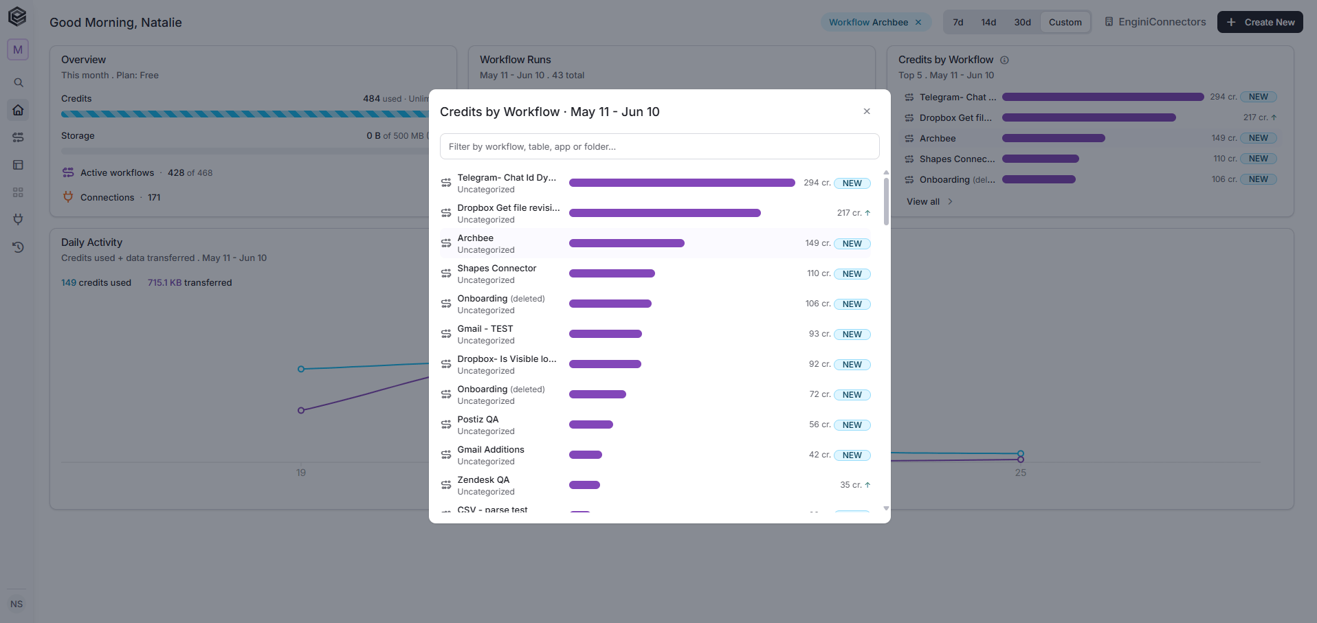
A breakdown of your top 5 most active or resource-heavy automations. This widget acts as an interactive filter for your entire dashboard:- Interactive Filtering: Clicking on any workflow in this list instantly filters the rest of your screen. The Workflow Runs pie chart and the Daily Activity chart will automatically change to show data only for that specific workflow.
-
View all Button: Clicking this opens a full, comprehensive modal containing your complete list of workflows from the last month. Here, you can search, filter, and view the credit consumption details of every single process in your account.
Daily Activity Analytics
The main chart at the bottom maps out your system behavior day by day, combining two critical metrics over time:- Credits Used (Light Blue Line): Tracks the volume of operations executed daily, helping you identify peak operational days.
- Data Transferred (Purple Line): Monitors the volume of data (in Megabytes/Kilobytes) moving through your integrations.
-
Hover to Inspect: Hovering your mouse cursor over any specific data point on the chart instantly displays a tooltip with the exact date, total credits consumed, and exact data transferred for that specific day.
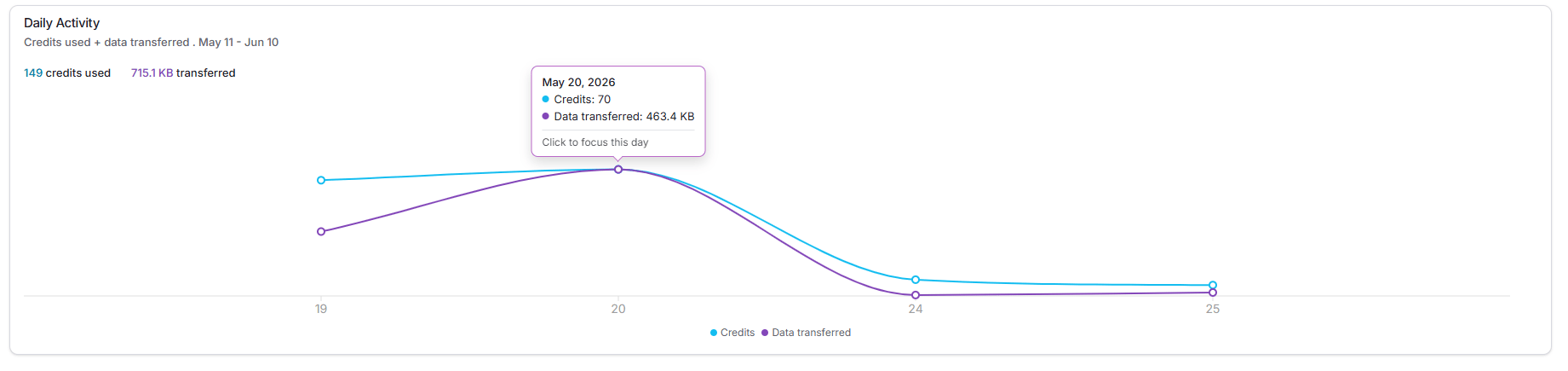
- Click to Focus & Filter: Clicking on a specific day point locks the dashboard’s focus onto that date. Once clicked, the Workflow Runs pie chart and the Credits by Workflow leaderboard will instantly change to display the exact metrics and resource consumption for that selected day only.
Sidebar Navigation
The icons on the left menu bar allow you to switch between sections:- Home: Your current screen.
- Workflows: Where you manage, edit, and build your automated flows.
- Tables: Where you store, organize, and view your data.
- Apps: Where you use the AppMaker to build, design, and configure custom internal applications and user interfaces.
- Connections: Where you manage and connect your external tools.
- History: Your full audit trail for monitoring live runs and tracing system errors.