> ## Documentation Index
> Fetch the complete documentation index at: https://docs.engini.ai/llms.txt
> Use this file to discover all available pages before exploring further.
# App Editor
Screens are the backbone of your app, defining its structure and user interface.
Each new screen becomes an opportunity to design unique user interfaces and interactions, tailoring your app to your specific needs.
# Step 1: Add screen
When you create a new application, a starting point is already set –
the first screen is automatically generated.
To expand your application’s functionality and structure,
simply click on the + icon to add additional screens.
 # Step 2: Manage Screens
Use the three-dot menu next to a screen name to manage the selected screen.
Duplicate Or Delete a screen
1. Click on the three dots **•••** on the right side of the Screen you want to duplicate/delete at the screens section.
# Step 2: Manage Screens
Use the three-dot menu next to a screen name to manage the selected screen.
Duplicate Or Delete a screen
1. Click on the three dots **•••** on the right side of the Screen you want to duplicate/delete at the screens section.
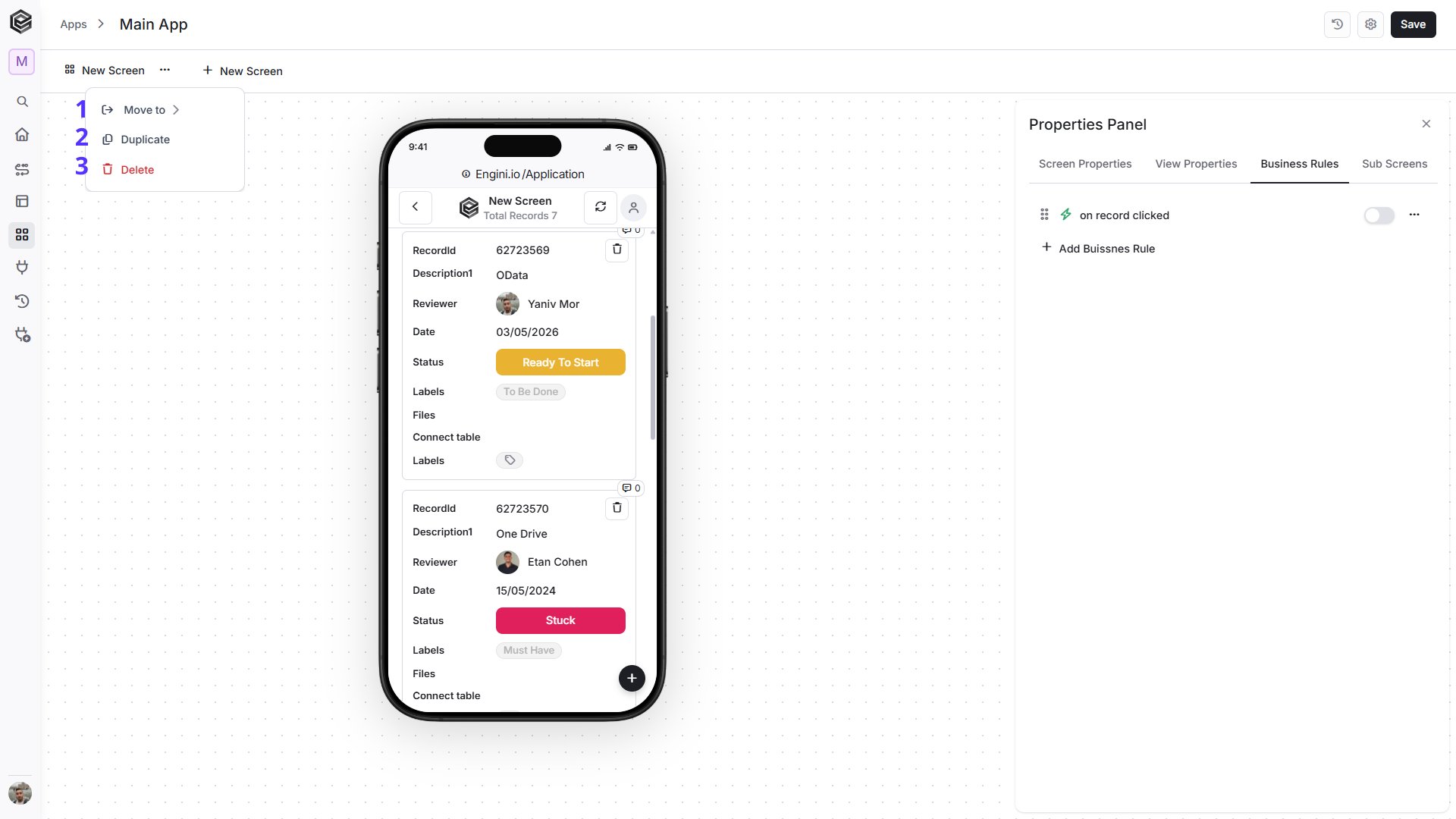
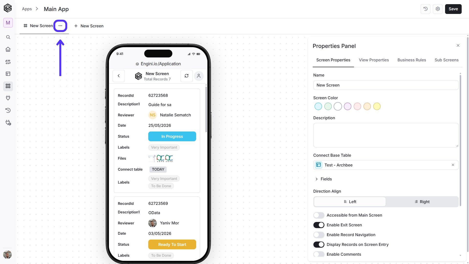 2. Click on the action you wish to execute.
 ## Duplicate Screen
1. Click the **three-dot menu** next to the screen you want to duplicate.
2. Select **Duplicate**.
3. A copy of the selected screen will be created in the same app.
## Delete Screen
1. Click the **three-dot menu** next to the screen you want to delete.
2. Select **Delete**.
3. Confirm the deletion when prompted.
## Move to App
1. Click the **three-dot menu** next to the screen you want to move.
2. Select **Move to App**.
3. Choose the destination app where you want to move the screen.
## Refresh Screen
The **Refresh** button lets you manually reload the current screen to display the most up-to-date data. Use it to ensure that any recent changes or updates are reflected immediately.
1. Select your base table (the refresh icon appears after selecting a base table).
## Duplicate Screen
1. Click the **three-dot menu** next to the screen you want to duplicate.
2. Select **Duplicate**.
3. A copy of the selected screen will be created in the same app.
## Delete Screen
1. Click the **three-dot menu** next to the screen you want to delete.
2. Select **Delete**.
3. Confirm the deletion when prompted.
## Move to App
1. Click the **three-dot menu** next to the screen you want to move.
2. Select **Move to App**.
3. Choose the destination app where you want to move the screen.
## Refresh Screen
The **Refresh** button lets you manually reload the current screen to display the most up-to-date data. Use it to ensure that any recent changes or updates are reflected immediately.
1. Select your base table (the refresh icon appears after selecting a base table).
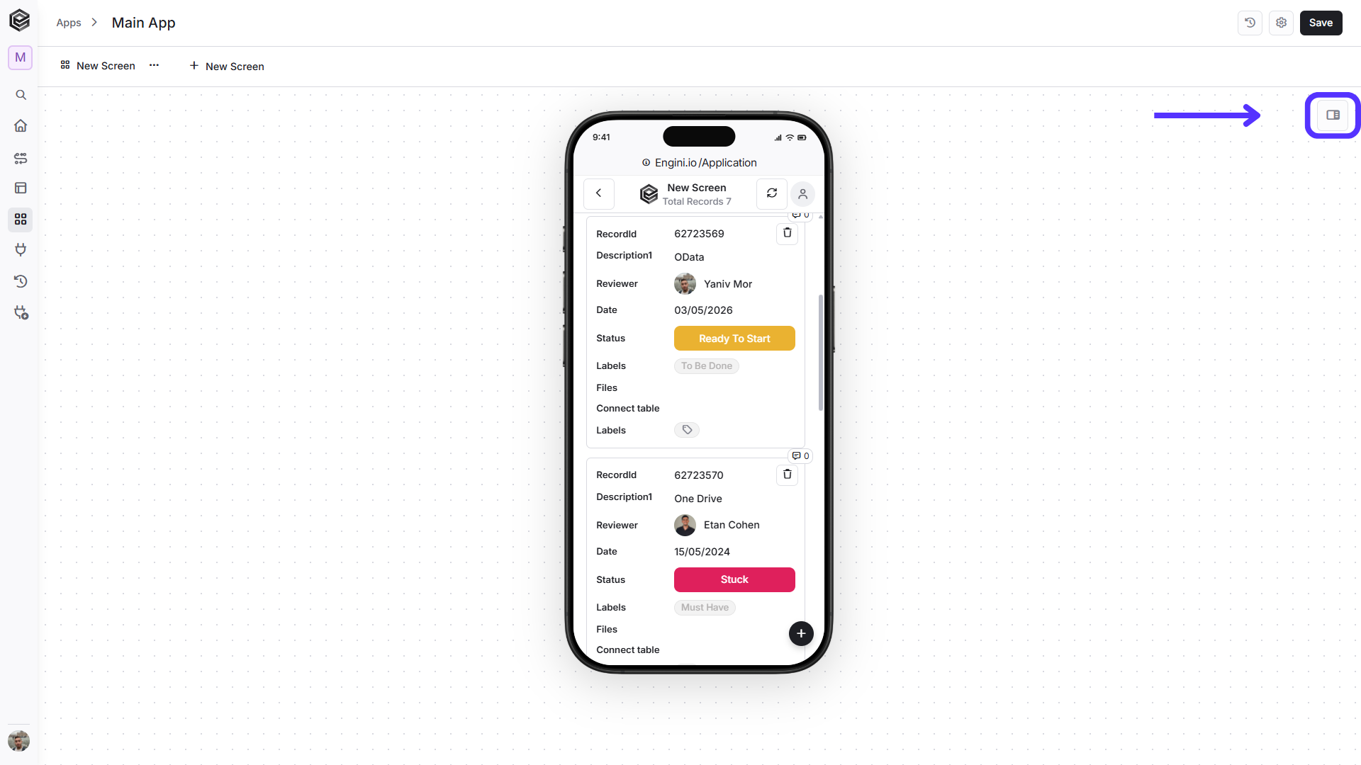
 2. Tap the icon at the top right corner.
# Step 3: Adjust properties
The app creation board is located on the right side of the application. Through it, you can edit, modify, and configure your application’s screens and sub-screens.
2. Tap the icon at the top right corner.
# Step 3: Adjust properties
The app creation board is located on the right side of the application. Through it, you can edit, modify, and configure your application’s screens and sub-screens.
 ## Screen Properties
Allows you to configure the general settings and behavior of the selected screen, including its name, appearance, connected data, layout options, and other screen-level settings.
## Screen Properties
Allows you to configure the general settings and behavior of the selected screen, including its name, appearance, connected data, layout options, and other screen-level settings.
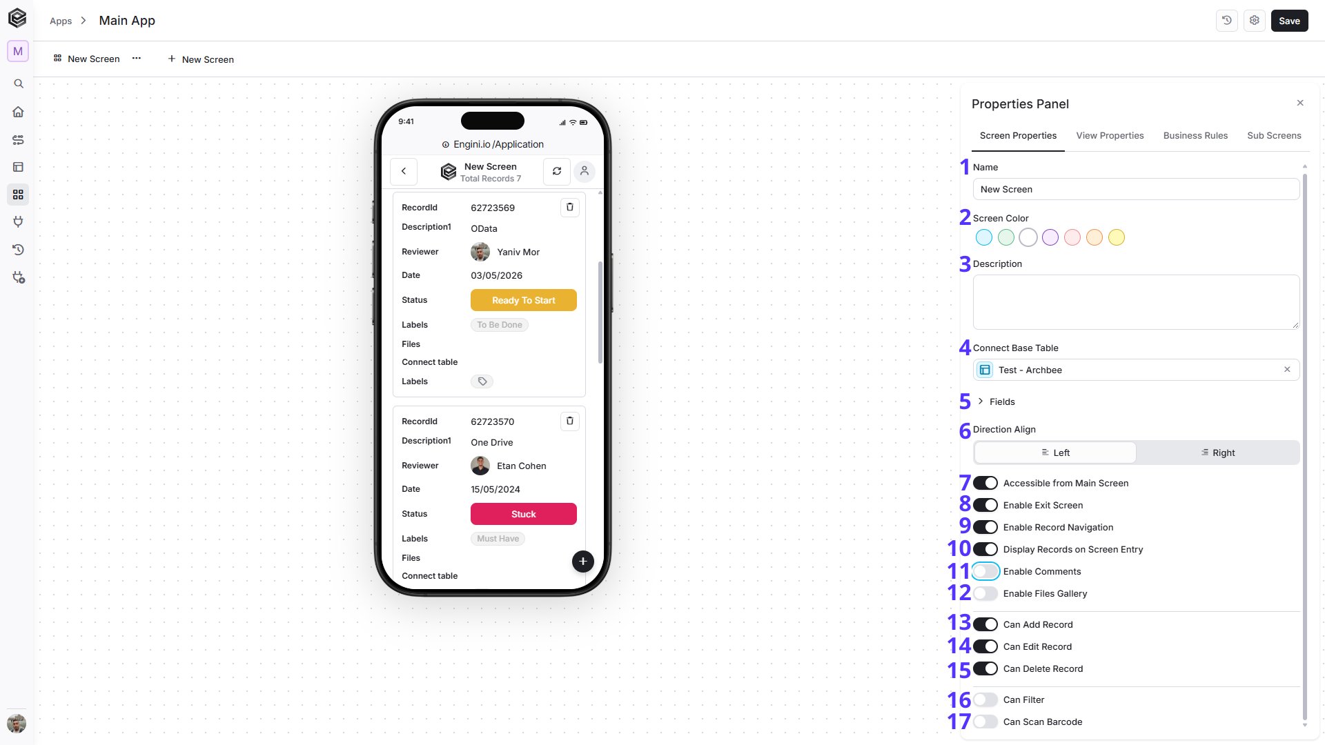 1. *Name -* The “Name” field allows you to give your screen a clear and descriptive label. This name will be visible to users and help them understand the purpose of the screen at a glance.
2. *Screen Color -* The “Screen Button Color” defines the color of the button that appears in the menu for navigating to this screen.
3. *Description -* The “Description” field provides a context for the screen’s purpose.
A clear description helps in understanding and organizing your screens effectively.
4. *Connect Base Table -* Selecting a “Base Table” lets you pick where your screen’s data comes from. It’s the main data that your screen shows and works with. Your app can get data directly from the Engini workbook’s tables.
5. *Fields -* are the building blocks of your screen. They define which data is displayed, collected, or used by the screen.
After connecting a Base Table, the table fields are available in the **Fields** section. You can also add additional fields according to your app requirements.
1. Click Add Field to open the list of available field types.
1. *Name -* The “Name” field allows you to give your screen a clear and descriptive label. This name will be visible to users and help them understand the purpose of the screen at a glance.
2. *Screen Color -* The “Screen Button Color” defines the color of the button that appears in the menu for navigating to this screen.
3. *Description -* The “Description” field provides a context for the screen’s purpose.
A clear description helps in understanding and organizing your screens effectively.
4. *Connect Base Table -* Selecting a “Base Table” lets you pick where your screen’s data comes from. It’s the main data that your screen shows and works with. Your app can get data directly from the Engini workbook’s tables.
5. *Fields -* are the building blocks of your screen. They define which data is displayed, collected, or used by the screen.
After connecting a Base Table, the table fields are available in the **Fields** section. You can also add additional fields according to your app requirements.
1. Click Add Field to open the list of available field types.
 2. Select the field type you want to add:
**Note:** *Field Name -* Available for every field type. Enter the name that should identify the field on the screen. This setting appears automatically whenever a new field is added.
1. *Status -* Adds a status field for displaying or selecting predefined status values.
2. *Text -* Adds a text field for entering or displaying text values.
2. Select the field type you want to add:
**Note:** *Field Name -* Available for every field type. Enter the name that should identify the field on the screen. This setting appears automatically whenever a new field is added.
1. *Status -* Adds a status field for displaying or selecting predefined status values.
2. *Text -* Adds a text field for entering or displaying text values.
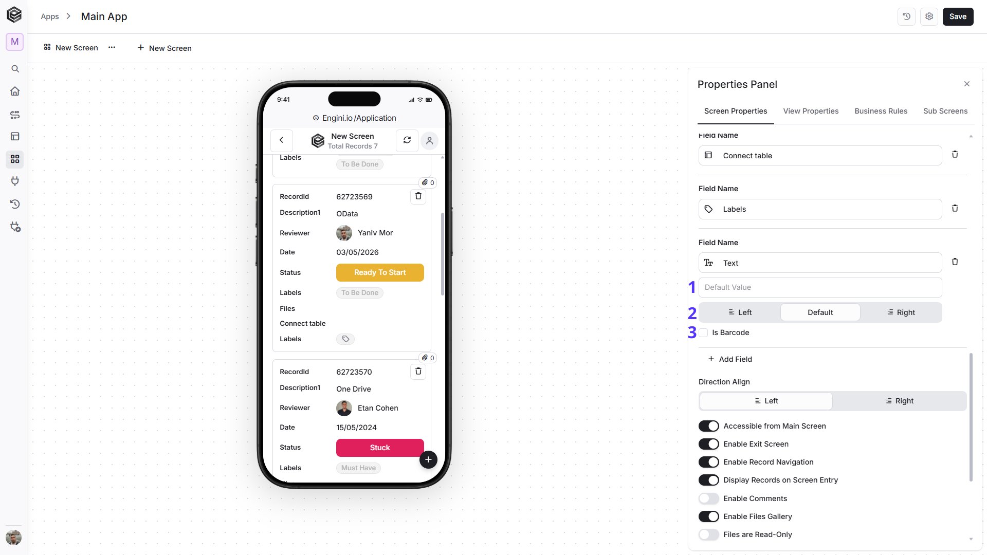 1. *Default Value -* Enter a value that should appear automatically when the field is first displayed.
2. *Text Direction -* Select how the text should be aligned and displayed: Left, Default, or Right.
3. *Is Barcode -* Enable this option to allow the text field to be used for barcode input or scanning.
3. *Collaborators -* Adds a field for selecting users or collaborators.
4. *Checkbox -* Adds a True/False checkbox field.
5. *Files -* Adds a field for displaying or managing files.
6. *Dropdown -* Adds a dropdown field for selecting from predefined values.
7. *Labels -* Adds a labels field for assigning one or more labels.
8. *Date -* Adds a date field for selecting or displaying date values.
1. *Default Value -* Enter a value that should appear automatically when the field is first displayed.
2. *Text Direction -* Select how the text should be aligned and displayed: Left, Default, or Right.
3. *Is Barcode -* Enable this option to allow the text field to be used for barcode input or scanning.
3. *Collaborators -* Adds a field for selecting users or collaborators.
4. *Checkbox -* Adds a True/False checkbox field.
5. *Files -* Adds a field for displaying or managing files.
6. *Dropdown -* Adds a dropdown field for selecting from predefined values.
7. *Labels -* Adds a labels field for assigning one or more labels.
8. *Date -* Adds a date field for selecting or displaying date values.
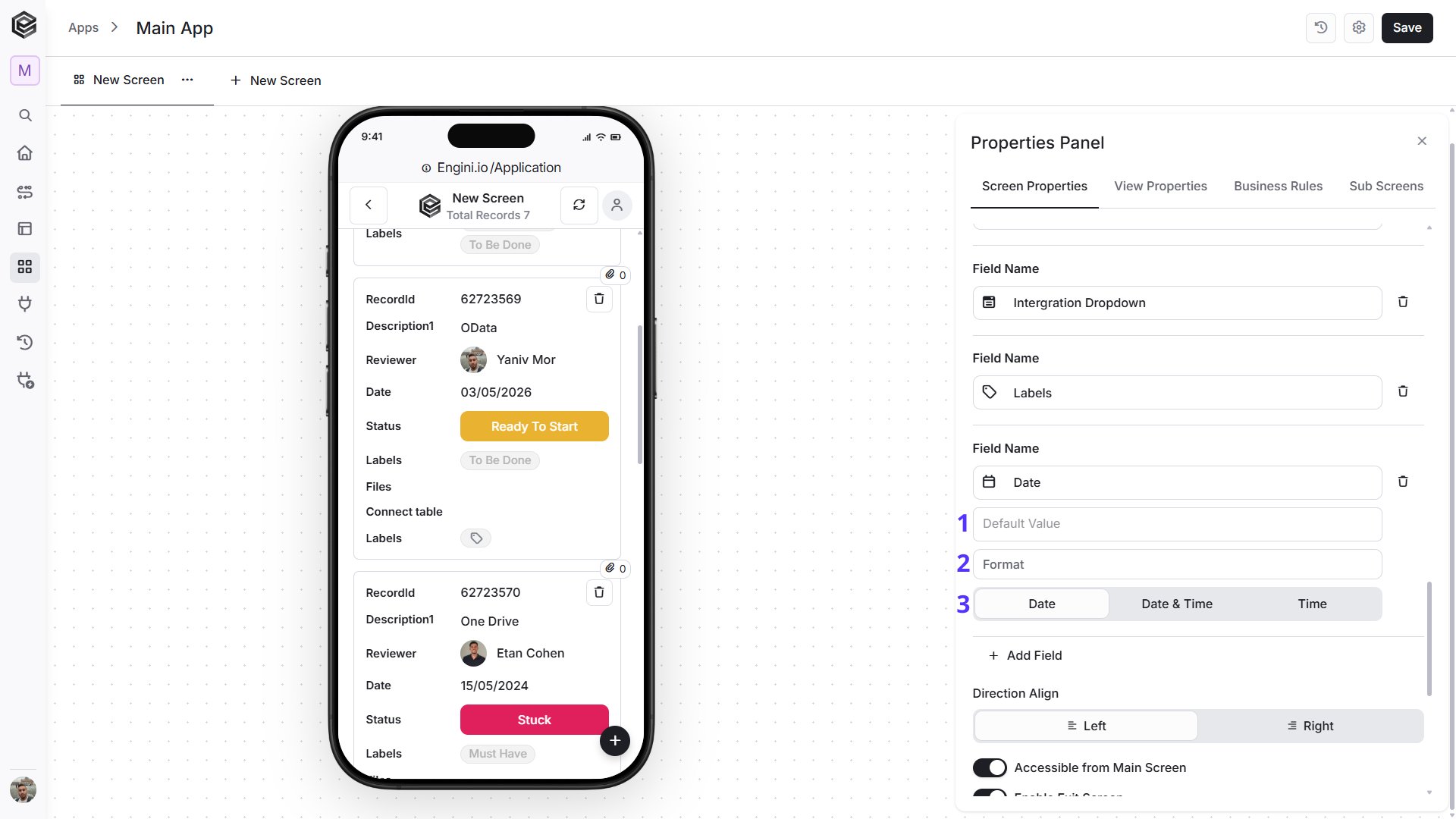 1. *Default Value -* Enter the value that should be displayed automatically when the field is first shown.
2. *Format -* Define how the date or time value should be displayed.
3. *Date Type -* Select the type of value the field should use: **Date**, **Date & Time**, or **Time**.
9. *Number -* Adds a numeric field for entering or displaying number values.
1. *Default Value -* Enter the value that should be displayed automatically when the field is first shown.
2. *Format -* Define how the date or time value should be displayed.
3. *Date Type -* Select the type of value the field should use: **Date**, **Date & Time**, or **Time**.
9. *Number -* Adds a numeric field for entering or displaying number values.
 1. *Default Value -* Enter the numeric value that should appear automatically when the field is first displayed.
2. *Format -* Define how the numeric value should be displayed.
3. *Is Barcode -* Enable this option to allow the number field to be used for barcode input or scanning.
10. *URL -* Adds a field for storing or displaying a web address.
11. *Button -* Adds a clickable button that can be used to trigger actions or Business Rules.
1. *Default Value -* Enter the numeric value that should appear automatically when the field is first displayed.
2. *Format -* Define how the numeric value should be displayed.
3. *Is Barcode -* Enable this option to allow the number field to be used for barcode input or scanning.
10. *URL -* Adds a field for storing or displaying a web address.
11. *Button -* Adds a clickable button that can be used to trigger actions or Business Rules.
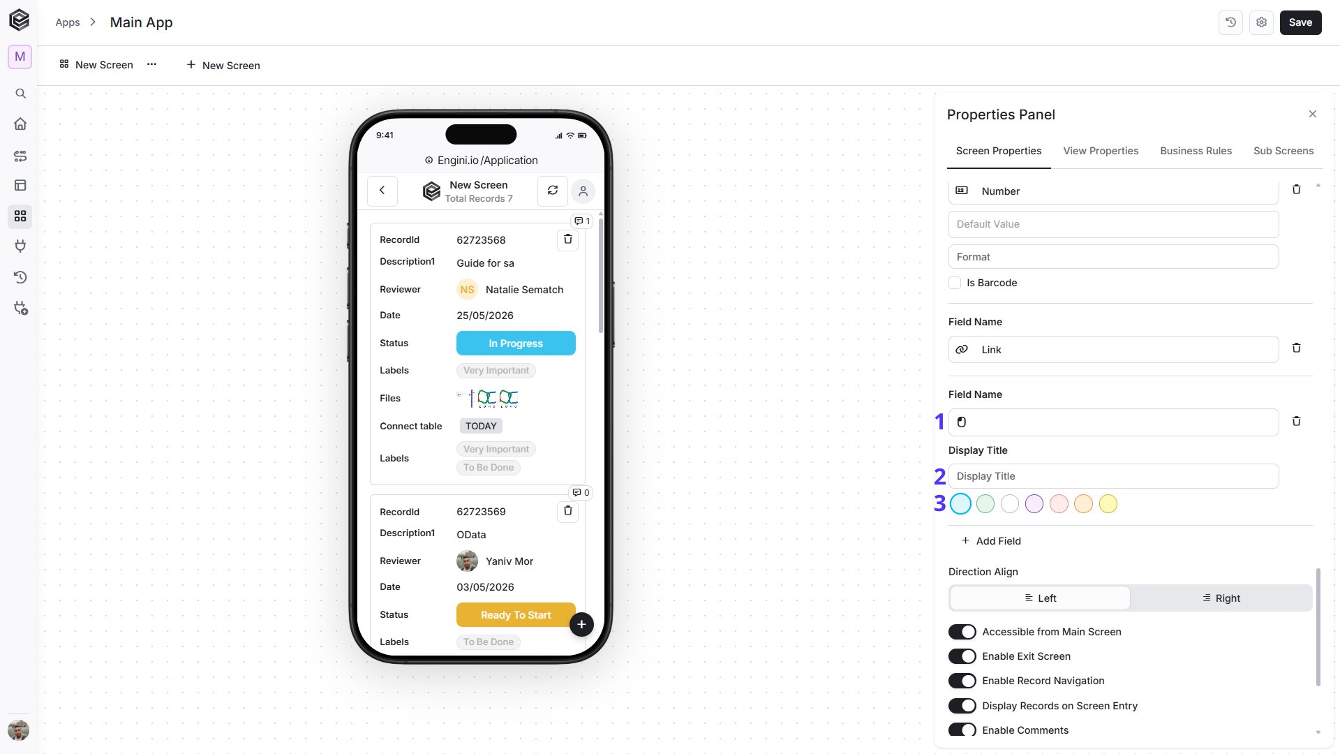 1. *Field Name -* This field is read-only and cannot be edited directly. Its value is generated automatically based on the **Display Title**.
2. *Display Title -* Enter the text that should appear on the button. This value is also used to determine the Field Name.
3. *Color -* Select the color used to display the button in the app.
3. After selecting a field type, configure the available settings for that field.
**Note:** For more information about the Fields types, go to Build a Table.
6. *Direction Align -* Sets the layout orientation of your screen. Choose between options: left-to-right or right-to-left.
7. *Accessible from Main Screen -* The “Accessible from Main Screen” option allows direct access to this screen from the main application screen. When enabled, the screen is accessible from the main application screen.
8. *Enable Exit Screen -* The “Enable Exit Screen” option adds a button on the screen that allows the user to exit and return to the main menu.
9. *Enable Record Navigation -* When this option is enabled, navigation arrows will appear at the bottom of the detailed view screen, allowing you to quickly move between records without returning to the main screen.
10. *Display records on Screen Entry -* “Display records on screen entry” sets a predefined context for the screen by populating it with specific data upon opening.
11. *Enable Comments -* Enable this option to allow comments to be displayed and used on the screen.
• *Comments are Read only -* This option appears after enabling comments. When enabled, users can view existing comments but cannot add new comments or reply to existing ones.
12. *Enable Files Gallery -* Enable this option to allow files associated with the record to be displayed and managed from the screen.
• *Files are Read-Only -* This option appears after enabling the Files Gallery. When enabled, users can view existing files but cannot add, edit, or remove files.
13. *Can Add Record -* Allows users to add new records from this screen.
14. *Can Edit Record -* Allows users to edit existing records from this screen.
15. *Can Delete Record -* Allows users to delete records from this screen.
16. *Can Filter -* Turn on “Can Filter” to help users easily find and explore data.
**Important:**
Search will query the result displayed on the screen while filter will perform a query against the table records and will refresh the screen to display the results.
17. *Can Scan Barcode -* Enable this option to allow barcode scanning in your app. When enabled, additional barcode settings become available.
• *Text Direction -* Defines the direction in which the barcode text is displayed. Choose between Left, Default, or Right.
• *Autocomplete -* When enabled, additional settings appear that allow Engini to automatically complete related field values based on the scanned barcode.
**Barcode Search Definition**
1. Select the table that should be used to search for matching values.
2. Select the field from which the values should be retrieved.
**Search in Fields**
1. Click **Add Field**.
2. Select the field you want to search in.
3. Repeat these steps to add additional fields. **Important:** Without making this choice, certain crucial functionalities will remain out of reach. Make sure to pick your base table to unlock the full potential of your application.
## View Properties
The **View Properties** section controls how records are displayed on the selected screen.
1. *Field Name -* This field is read-only and cannot be edited directly. Its value is generated automatically based on the **Display Title**.
2. *Display Title -* Enter the text that should appear on the button. This value is also used to determine the Field Name.
3. *Color -* Select the color used to display the button in the app.
3. After selecting a field type, configure the available settings for that field.
**Note:** For more information about the Fields types, go to Build a Table.
6. *Direction Align -* Sets the layout orientation of your screen. Choose between options: left-to-right or right-to-left.
7. *Accessible from Main Screen -* The “Accessible from Main Screen” option allows direct access to this screen from the main application screen. When enabled, the screen is accessible from the main application screen.
8. *Enable Exit Screen -* The “Enable Exit Screen” option adds a button on the screen that allows the user to exit and return to the main menu.
9. *Enable Record Navigation -* When this option is enabled, navigation arrows will appear at the bottom of the detailed view screen, allowing you to quickly move between records without returning to the main screen.
10. *Display records on Screen Entry -* “Display records on screen entry” sets a predefined context for the screen by populating it with specific data upon opening.
11. *Enable Comments -* Enable this option to allow comments to be displayed and used on the screen.
• *Comments are Read only -* This option appears after enabling comments. When enabled, users can view existing comments but cannot add new comments or reply to existing ones.
12. *Enable Files Gallery -* Enable this option to allow files associated with the record to be displayed and managed from the screen.
• *Files are Read-Only -* This option appears after enabling the Files Gallery. When enabled, users can view existing files but cannot add, edit, or remove files.
13. *Can Add Record -* Allows users to add new records from this screen.
14. *Can Edit Record -* Allows users to edit existing records from this screen.
15. *Can Delete Record -* Allows users to delete records from this screen.
16. *Can Filter -* Turn on “Can Filter” to help users easily find and explore data.
**Important:**
Search will query the result displayed on the screen while filter will perform a query against the table records and will refresh the screen to display the results.
17. *Can Scan Barcode -* Enable this option to allow barcode scanning in your app. When enabled, additional barcode settings become available.
• *Text Direction -* Defines the direction in which the barcode text is displayed. Choose between Left, Default, or Right.
• *Autocomplete -* When enabled, additional settings appear that allow Engini to automatically complete related field values based on the scanned barcode.
**Barcode Search Definition**
1. Select the table that should be used to search for matching values.
2. Select the field from which the values should be retrieved.
**Search in Fields**
1. Click **Add Field**.
2. Select the field you want to search in.
3. Repeat these steps to add additional fields. **Important:** Without making this choice, certain crucial functionalities will remain out of reach. Make sure to pick your base table to unlock the full potential of your application.
## View Properties
The **View Properties** section controls how records are displayed on the selected screen.
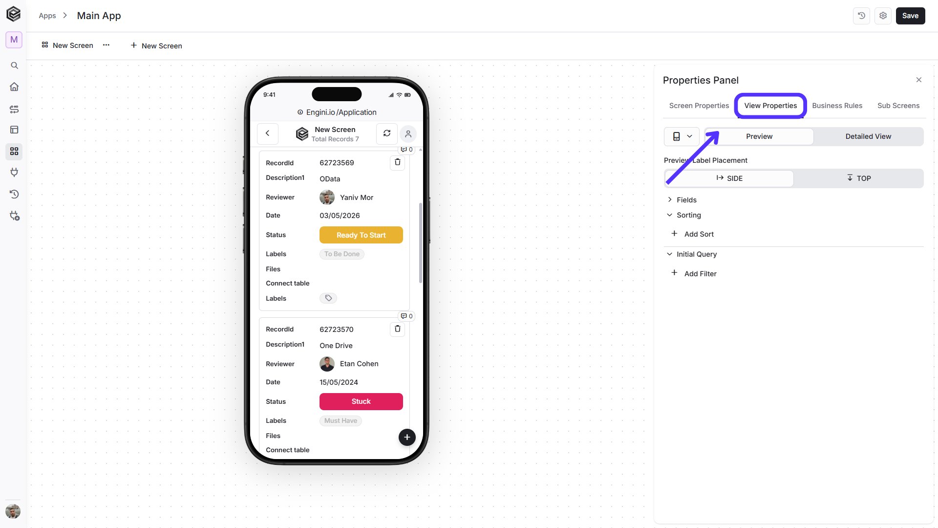 From here, you can switch between two view types:
* *Preview -* Controls how records are displayed in the main screen of the app.
* *Detailed View -* Controls how a specific record is displayed when it is opened.
You can also choose the preview device from the device selector:
* *Mobile -* Simulates how the screen will appear on a mobile device.
* *Desktop -* Simulates how the screen will appear on a desktop layout. Desktop view may include additional layout options, such as **Number of Columns**.
Then configure the available options for the selected view and device, such as field visibility, sorting, filtering, and layout settings.
### Preview
The **Preview** view controls how records are displayed in the main screen of the app.
From here, you can switch between two view types:
* *Preview -* Controls how records are displayed in the main screen of the app.
* *Detailed View -* Controls how a specific record is displayed when it is opened.
You can also choose the preview device from the device selector:
* *Mobile -* Simulates how the screen will appear on a mobile device.
* *Desktop -* Simulates how the screen will appear on a desktop layout. Desktop view may include additional layout options, such as **Number of Columns**.
Then configure the available options for the selected view and device, such as field visibility, sorting, filtering, and layout settings.
### Preview
The **Preview** view controls how records are displayed in the main screen of the app.
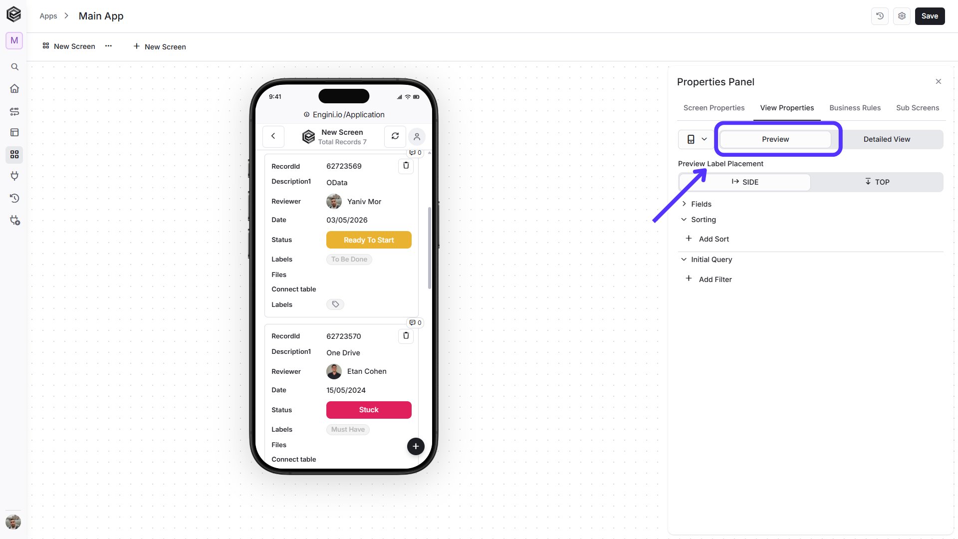 The available Preview settings depend on the selected device type. Mobile and Desktop share most configuration options, while Desktop includes additional layout settings such as **Number of Columns**. The following sections explain each available setting.
* *Mobile -* The Mobile view simulates how the app will appear on a phone. Use these settings to control how records, labels, fields, sorting, and filtering are displayed in the mobile layout.
The available Preview settings depend on the selected device type. Mobile and Desktop share most configuration options, while Desktop includes additional layout settings such as **Number of Columns**. The following sections explain each available setting.
* *Mobile -* The Mobile view simulates how the app will appear on a phone. Use these settings to control how records, labels, fields, sorting, and filtering are displayed in the mobile layout.
 The Mobile Preview includes several settings that allow you to control how the screen is displayed. The following fields define the layout, visible data, sorting, and filtering behavior.
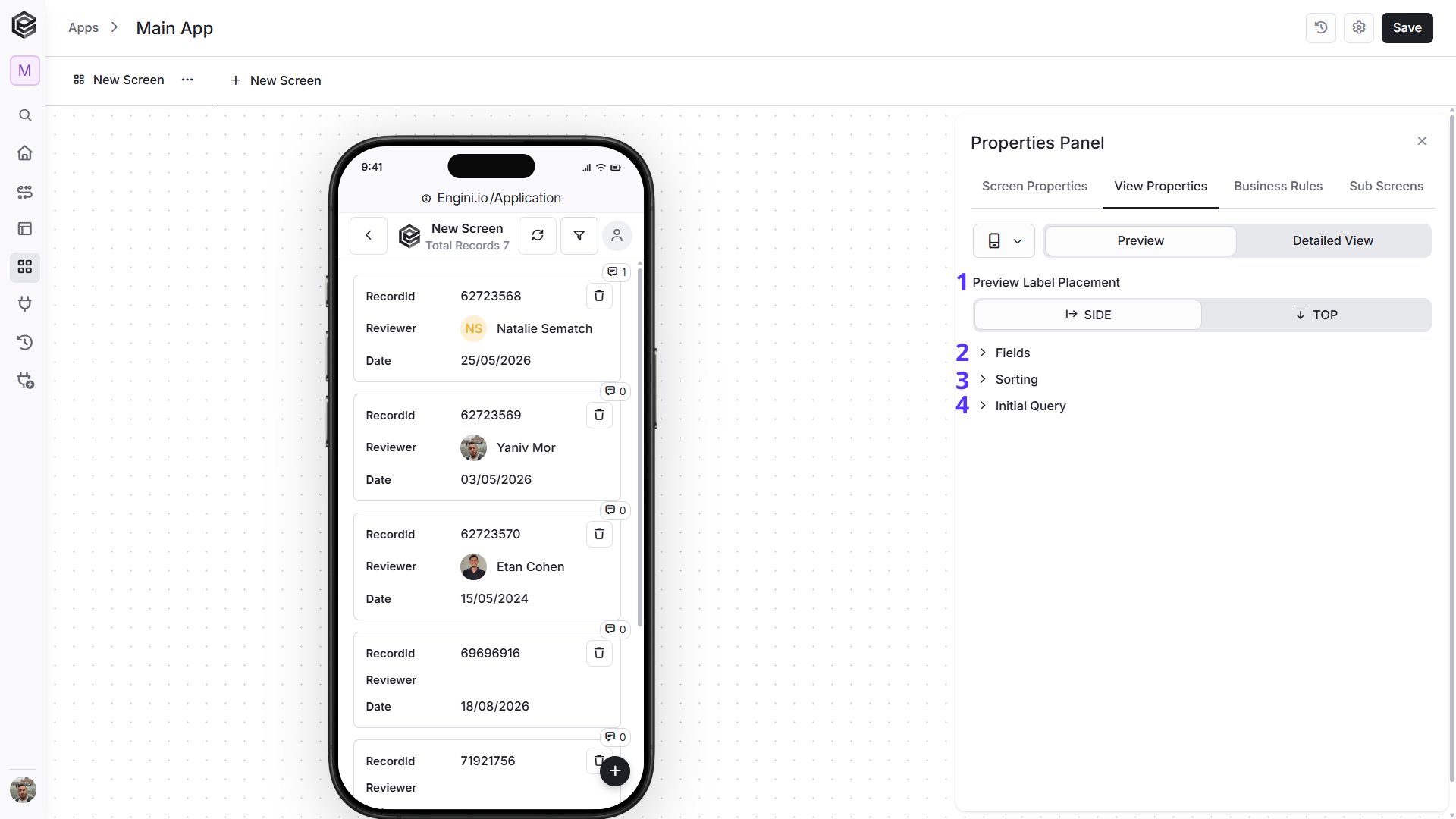 1. *Preview Label Placement -* Defines whether field labels appear beside the values or above them.
• *Side -* The default option. Displays the field label beside its value.
1. *Preview Label Placement -* Defines whether field labels appear beside the values or above them.
• *Side -* The default option. Displays the field label beside its value.
 • *Top -* Displays the field label above its value.
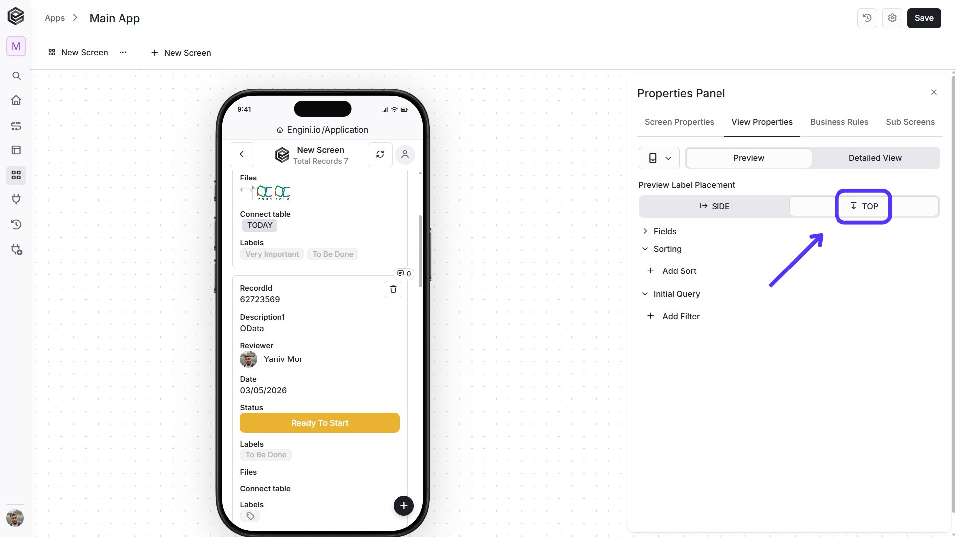 2. *Fields -* Controls which fields are displayed in the Preview and how they are presented.
 1. *Shown in app -* Displays the fields that are currently visible in the app.
2. *Hide all -* Hides all fields currently shown in the app.
3. *Drag and Drop -* Drag a field to change its display order in the app.
4. *Filter -* Enables filtering for the selected field. This option is available only when filtering is enabled in **Screen Properties**.
5. *Visibility -* Click the eye icon to hide the selected field from the app.
6. *Hidden in app -* Displays the fields that are currently hidden from the app.
7. *Show all -* Makes all hidden fields visible in the app again.
**Note:** Fields can be moved between **Shown in app** and **Hidden in app** individually using the visibility icon, or all at once using **Hide all** and **Show all**.
3. *Sorting -* Displays the sorting rules currently applied to the Preview.
1. *Shown in app -* Displays the fields that are currently visible in the app.
2. *Hide all -* Hides all fields currently shown in the app.
3. *Drag and Drop -* Drag a field to change its display order in the app.
4. *Filter -* Enables filtering for the selected field. This option is available only when filtering is enabled in **Screen Properties**.
5. *Visibility -* Click the eye icon to hide the selected field from the app.
6. *Hidden in app -* Displays the fields that are currently hidden from the app.
7. *Show all -* Makes all hidden fields visible in the app again.
**Note:** Fields can be moved between **Shown in app** and **Hidden in app** individually using the visibility icon, or all at once using **Hide all** and **Show all**.
3. *Sorting -* Displays the sorting rules currently applied to the Preview.
 1. *Sort Field -* Select the field that should be used to sort the records.
2. *Sort Direction -* Choose how the records should be ordered:
• *Ascending -* Sorts values from lowest to highest, A–Z, or oldest to newest.
• *Descending -* Sorts values from highest to lowest, Z–A, or newest to oldest.
3. *Add Sort -* Adds another sorting rule. Multiple sort rules can be used to further control the order of records.
4. *Initial Query -* Defines the conditions used to determine which records are loaded when the Preview opens.
1. *Sort Field -* Select the field that should be used to sort the records.
2. *Sort Direction -* Choose how the records should be ordered:
• *Ascending -* Sorts values from lowest to highest, A–Z, or oldest to newest.
• *Descending -* Sorts values from highest to lowest, Z–A, or newest to oldest.
3. *Add Sort -* Adds another sorting rule. Multiple sort rules can be used to further control the order of records.
4. *Initial Query -* Defines the conditions used to determine which records are loaded when the Preview opens.
 1. *Filter Field -* Select the field that should be used for the filter condition.
2. *Condition -* Select the comparison operator, such as **Is Equal**, **Is Not Empty**, **Greater**, and other available options.
3. *Value -* Enter the value that should be compared against the selected field. Depending on the selected condition, this field may not be required.
4. *Add Filter -* Adds another filter condition to further control which records are displayed.
* *Desktop -* The **Desktop** view simulates how the app will appear on a larger computer screen. It includes the same main configuration options as Mobile, with additional layout settings that are available specifically for desktop.
1. *Filter Field -* Select the field that should be used for the filter condition.
2. *Condition -* Select the comparison operator, such as **Is Equal**, **Is Not Empty**, **Greater**, and other available options.
3. *Value -* Enter the value that should be compared against the selected field. Depending on the selected condition, this field may not be required.
4. *Add Filter -* Adds another filter condition to further control which records are displayed.
* *Desktop -* The **Desktop** view simulates how the app will appear on a larger computer screen. It includes the same main configuration options as Mobile, with additional layout settings that are available specifically for desktop.
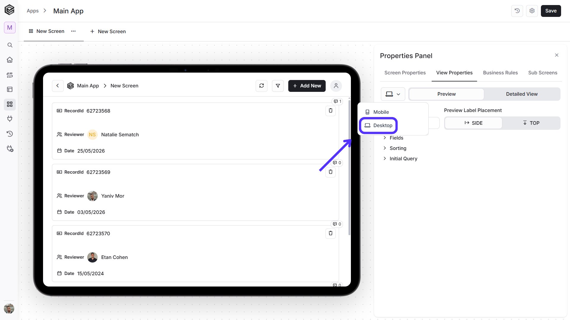 The Desktop Preview includes settings for layout, visible fields, sorting, and filtering. In addition, you can define how many columns are used to arrange the displayed fields.
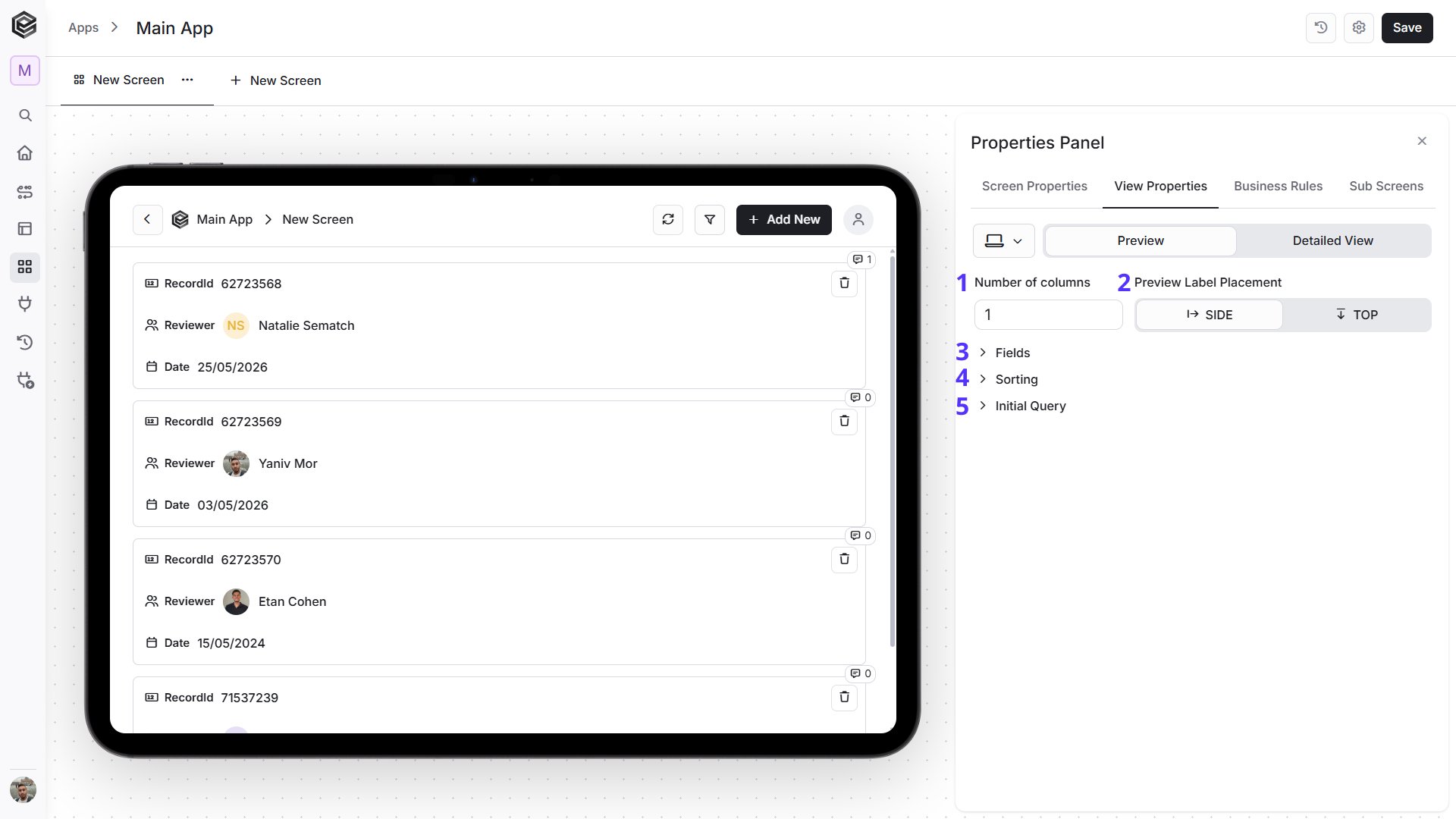 1. *Number of Columns -* Defines how many columns are used to arrange the displayed fields in the Desktop Preview. You can configure up to **12 columns**.
2. *Preview Label Placement -* Defines whether field labels appear beside the values or above them.
• *Side -* The default option. Displays the field label beside its value.
1. *Number of Columns -* Defines how many columns are used to arrange the displayed fields in the Desktop Preview. You can configure up to **12 columns**.
2. *Preview Label Placement -* Defines whether field labels appear beside the values or above them.
• *Side -* The default option. Displays the field label beside its value.
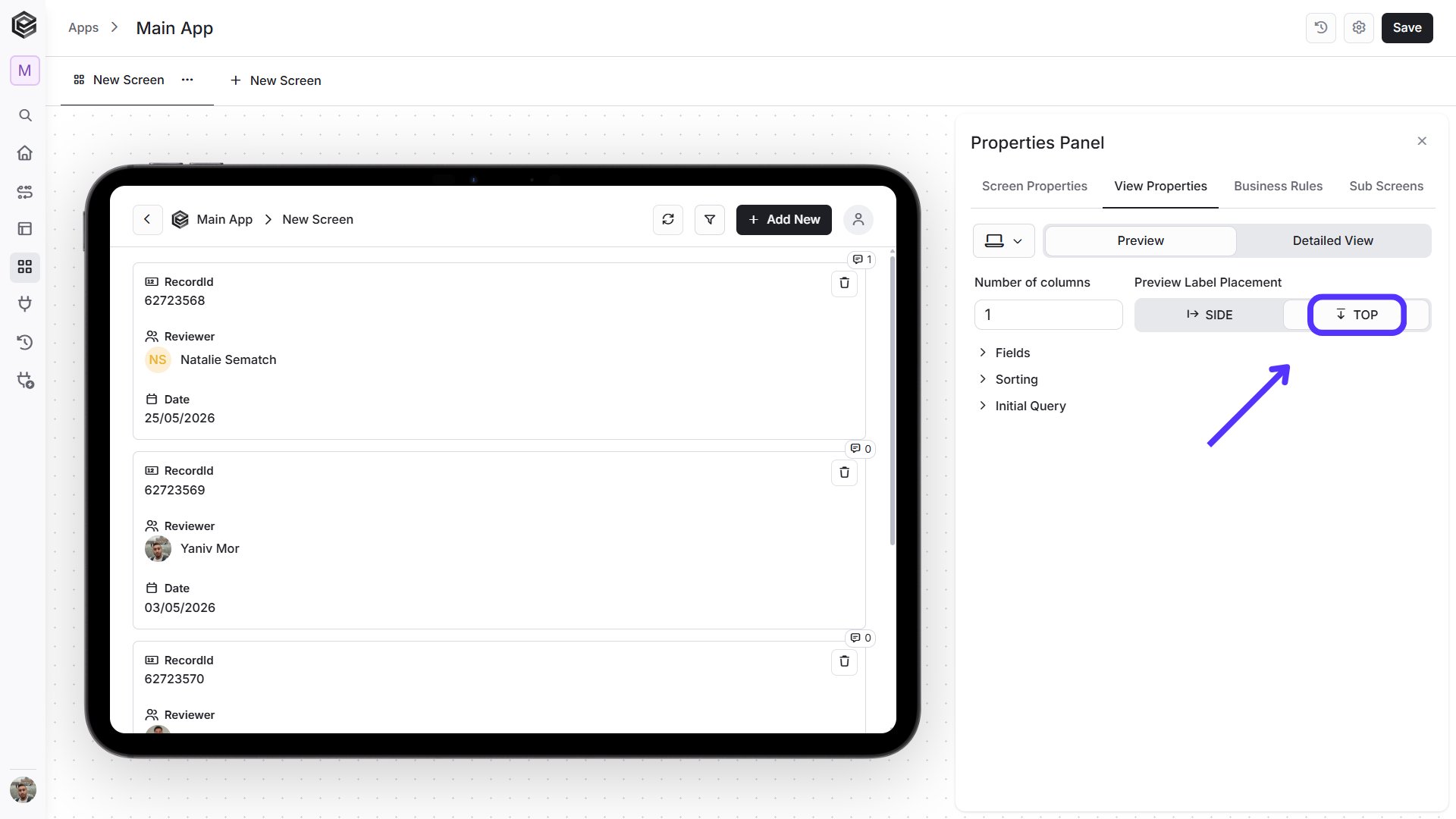
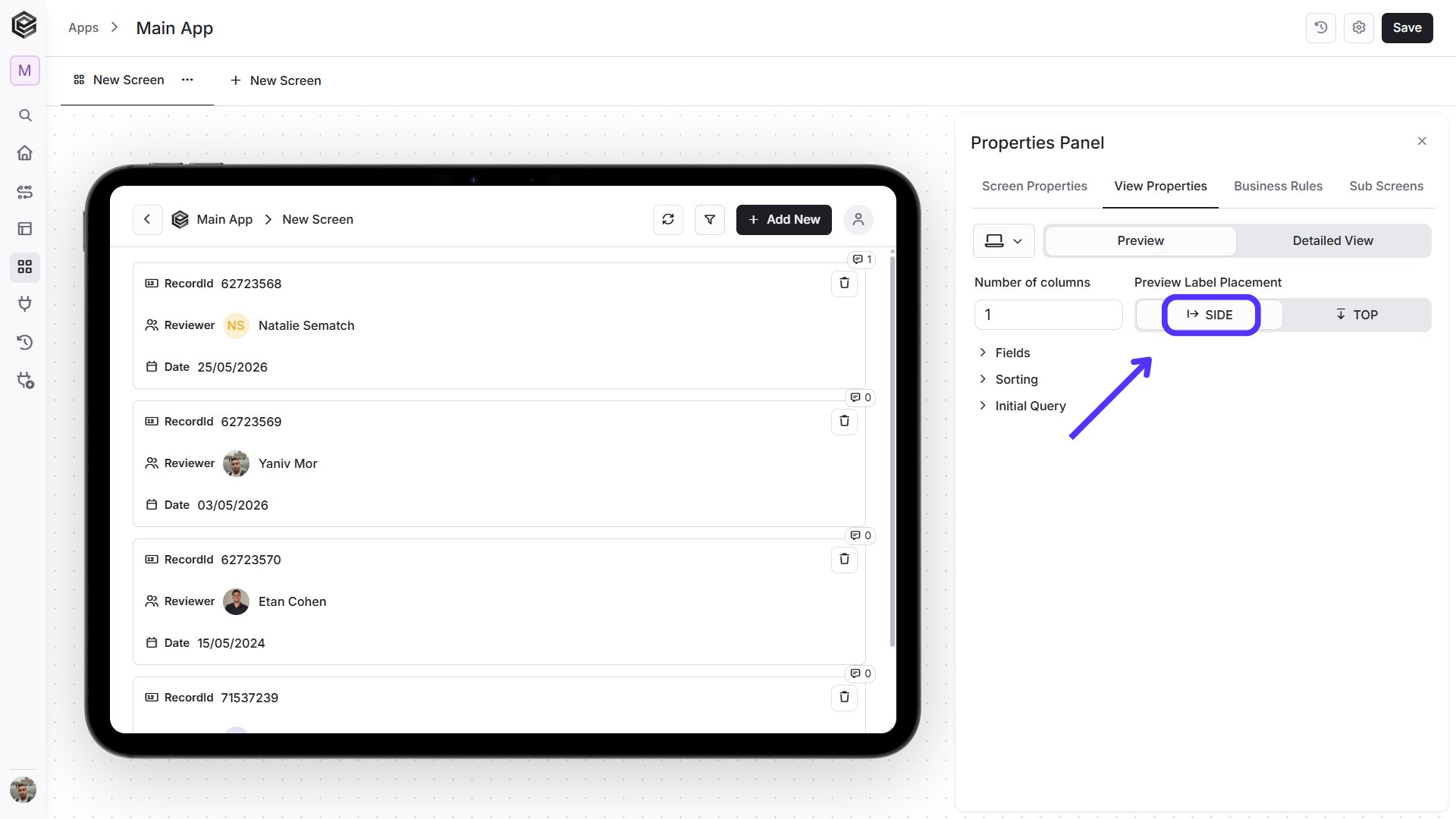 • *Top -* Displays the field label above its value.
 3. *Fields -* Controls which fields are displayed in the Preview and how they are presented.
 1. *Shown in app -* Displays the fields that are currently visible in the Desktop Preview.
2. *Row -* Defines the row position of the field in the desktop layout.
3. *Col -* Defines the column position of the field. The available column positions depend on the configured **Number of Columns**.
4. *Hide all -* Hides all fields currently shown in the app.
5. *Filter -* Enables filtering for the selected field. This option is available when filtering is enabled in **Screen Properties**.
6. *Visibility -* Click the eye icon to hide the selected field from the app.
7. *Hidden in app -* Displays the fields that are currently hidden.
8. *Show all -* Makes all hidden fields visible again.
4. *Sorting -* Controls the order in which records are displayed.
1. *Shown in app -* Displays the fields that are currently visible in the Desktop Preview.
2. *Row -* Defines the row position of the field in the desktop layout.
3. *Col -* Defines the column position of the field. The available column positions depend on the configured **Number of Columns**.
4. *Hide all -* Hides all fields currently shown in the app.
5. *Filter -* Enables filtering for the selected field. This option is available when filtering is enabled in **Screen Properties**.
6. *Visibility -* Click the eye icon to hide the selected field from the app.
7. *Hidden in app -* Displays the fields that are currently hidden.
8. *Show all -* Makes all hidden fields visible again.
4. *Sorting -* Controls the order in which records are displayed.
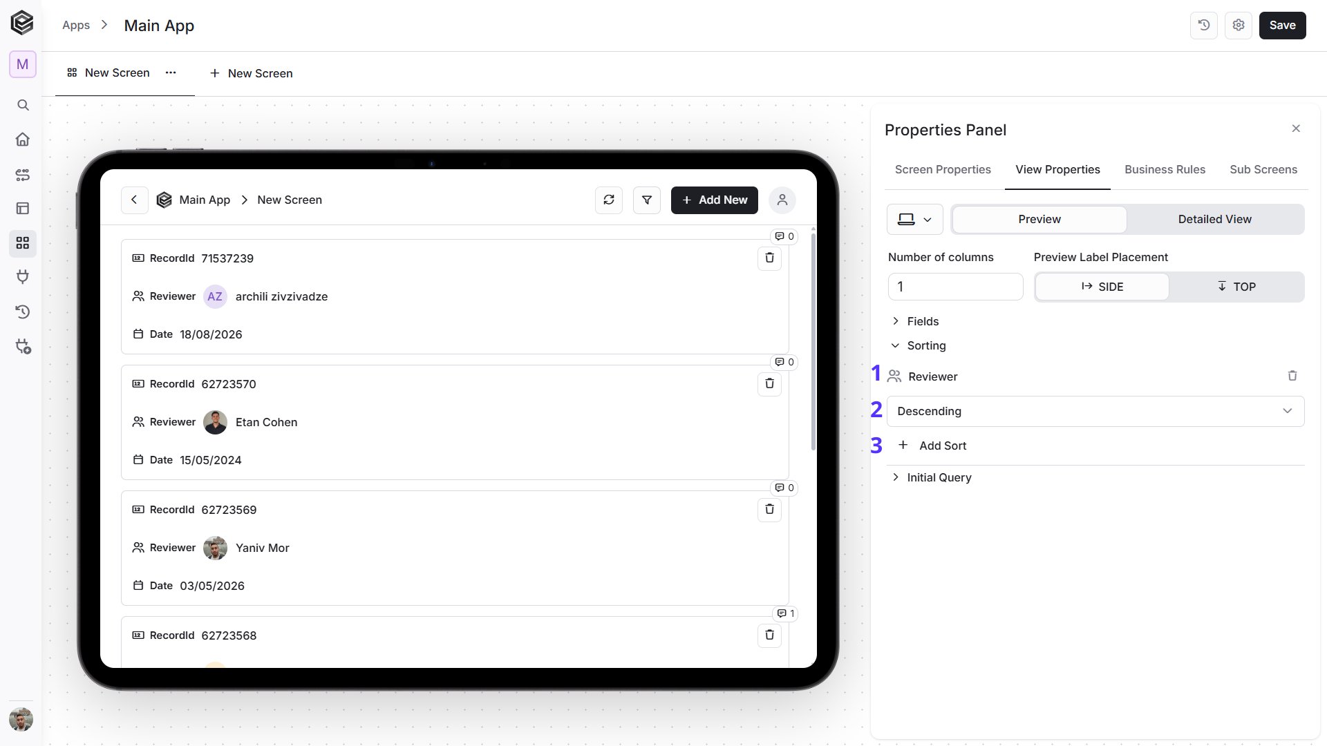 1. *Sort Field -* Select the field that should be used to sort the records.
2. *Sort Direction -* Choose how the records should be ordered:
• *Ascending -* Sorts values from lowest to highest, A–Z, or oldest to newest.
• *Descending -* Sorts values from highest to lowest, Z–A, or newest to oldest.
3. *Add Sort -* Adds another sorting rule to further control the order in which records are displayed.
5. *Initial Query -* Defines the conditions used to determine which records are loaded when the Preview opens.
1. *Sort Field -* Select the field that should be used to sort the records.
2. *Sort Direction -* Choose how the records should be ordered:
• *Ascending -* Sorts values from lowest to highest, A–Z, or oldest to newest.
• *Descending -* Sorts values from highest to lowest, Z–A, or newest to oldest.
3. *Add Sort -* Adds another sorting rule to further control the order in which records are displayed.
5. *Initial Query -* Defines the conditions used to determine which records are loaded when the Preview opens.
 1. *Filter Field -* Select the field that should be used for the filter condition.
2. *Condition -* Select the comparison operator, such as **Is Equal**, **Is Not Empty**, **Greater**, and other available options.
3. *Value -* Enter the value that should be compared against the selected field. Depending on the selected condition, this field may not be required.
4. *Add Filter -* Adds another filter condition to further control which records are displayed.
### Detailed View
The **Detailed View** controls how a specific record is displayed when it is opened from the app. It allows you to configure the layout, visible fields, and available buttons for the selected record.
To access the Detailed View, click on one of the records displayed in the Preview. This opens the selected record in a more detailed view, where you can review its full information and, depending on the screen configuration, edit the record or create a new one.
1. *Filter Field -* Select the field that should be used for the filter condition.
2. *Condition -* Select the comparison operator, such as **Is Equal**, **Is Not Empty**, **Greater**, and other available options.
3. *Value -* Enter the value that should be compared against the selected field. Depending on the selected condition, this field may not be required.
4. *Add Filter -* Adds another filter condition to further control which records are displayed.
### Detailed View
The **Detailed View** controls how a specific record is displayed when it is opened from the app. It allows you to configure the layout, visible fields, and available buttons for the selected record.
To access the Detailed View, click on one of the records displayed in the Preview. This opens the selected record in a more detailed view, where you can review its full information and, depending on the screen configuration, edit the record or create a new one.
 Once a record is opened, the app switches from Preview to Detailed View.
 The available settings may vary depending on the selected device type. Mobile and Desktop share the same main configuration areas, while Desktop may include additional layout options.
* *Mobile -* The **Mobile Detailed View** simulates how a specific record will appear when opened on a phone.
The available settings may vary depending on the selected device type. Mobile and Desktop share the same main configuration areas, while Desktop may include additional layout options.
* *Mobile -* The **Mobile Detailed View** simulates how a specific record will appear when opened on a phone.
 The available settings allow you to control the label placement, which fields are shown, and which buttons are available in the detailed record view.
 1. *Detailed View Label Placement -* Defines whether field labels appear beside their values or above them.
• *Side -* The default option. Displays the field label beside its value.
1. *Detailed View Label Placement -* Defines whether field labels appear beside their values or above them.
• *Side -* The default option. Displays the field label beside its value.
 • *Top -* Displays the field label above its value.
 2. *Fields -* Controls which fields are displayed in the Detailed View and how they are presented.
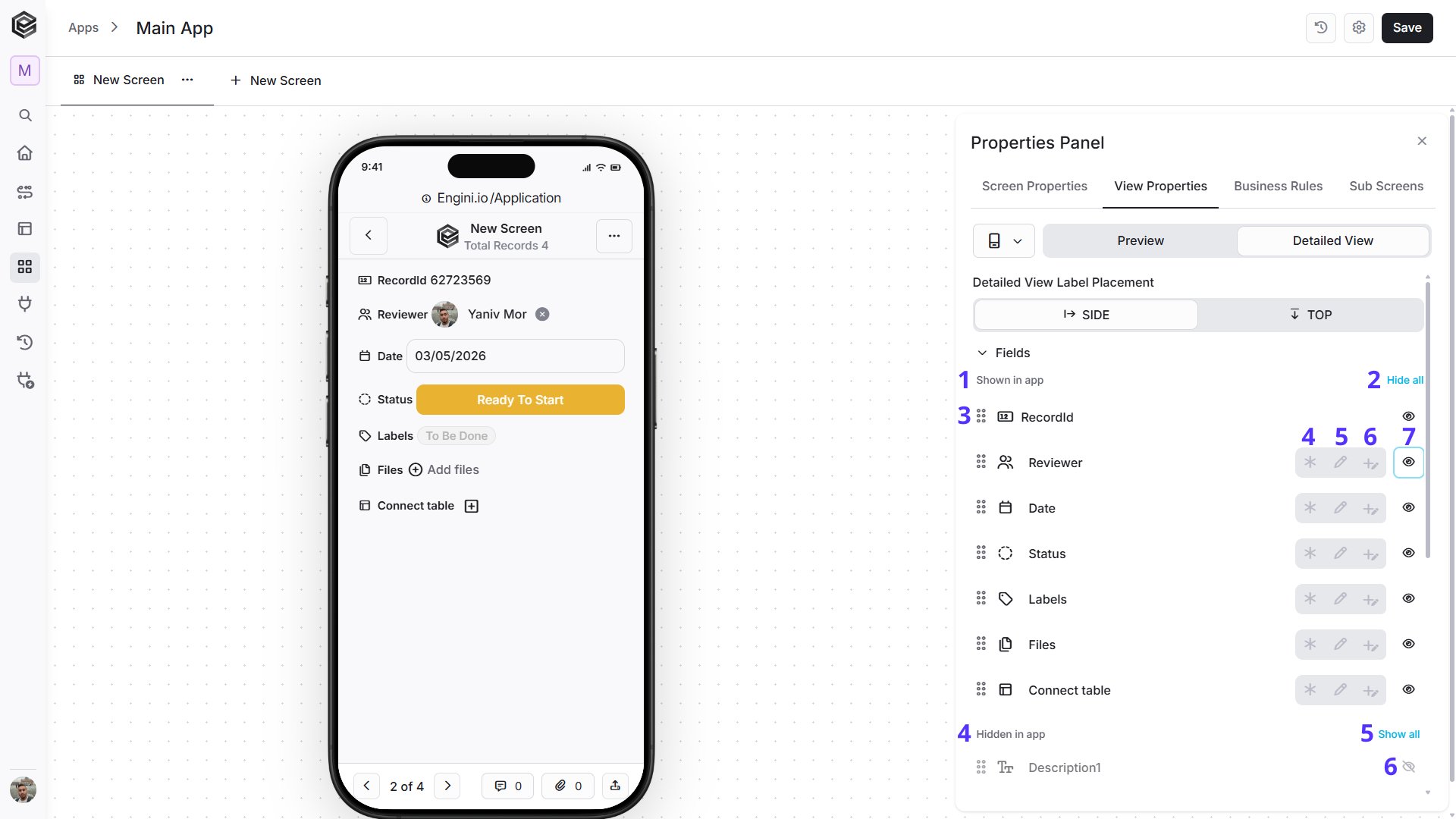 1. *Shown in app -* Displays the fields that are currently visible in the Detailed View.
2. *Hide all -* Hides all fields currently shown in the Detailed View.
3. *Drag and Drop -* Drag a field to change its order in the Detailed View.
4. *Required -* Marks the field as required. A value must be provided before the record can be completed or saved.
5. *Editable -* Allows the user to edit the field value in the Detailed View.
6. *Add / Input -* Allows a value to be added or entered for the field while working with the record.
7. *Visibility -* Click the eye icon to hide the selected field from the Detailed View.
8. *Hidden in app -* Displays the fields that are currently hidden from the Detailed View.
9. *Show all -* Makes all hidden fields visible again.
10. *Hidden field visibility -* Indicates that the field is currently hidden. Click the icon to make the field visible again.
3. *Buttons -* Controls which configured buttons are available in the Detailed View. Buttons can be shown or hidden according to the app's needs.
1. *Shown in app -* Displays the fields that are currently visible in the Detailed View.
2. *Hide all -* Hides all fields currently shown in the Detailed View.
3. *Drag and Drop -* Drag a field to change its order in the Detailed View.
4. *Required -* Marks the field as required. A value must be provided before the record can be completed or saved.
5. *Editable -* Allows the user to edit the field value in the Detailed View.
6. *Add / Input -* Allows a value to be added or entered for the field while working with the record.
7. *Visibility -* Click the eye icon to hide the selected field from the Detailed View.
8. *Hidden in app -* Displays the fields that are currently hidden from the Detailed View.
9. *Show all -* Makes all hidden fields visible again.
10. *Hidden field visibility -* Indicates that the field is currently hidden. Click the icon to make the field visible again.
3. *Buttons -* Controls which configured buttons are available in the Detailed View. Buttons can be shown or hidden according to the app's needs.
 1. *Drag and Drop -* Drag a button to change its position in the Detailed View.
2. *Visibility -* Click the eye icon to show or hide the selected button in the Detailed View.
* *Desktop -* The **Desktop Detailed View** simulates how an opened record will appear on a larger desktop screen.
1. *Drag and Drop -* Drag a button to change its position in the Detailed View.
2. *Visibility -* Click the eye icon to show or hide the selected button in the Detailed View.
* *Desktop -* The **Desktop Detailed View** simulates how an opened record will appear on a larger desktop screen.
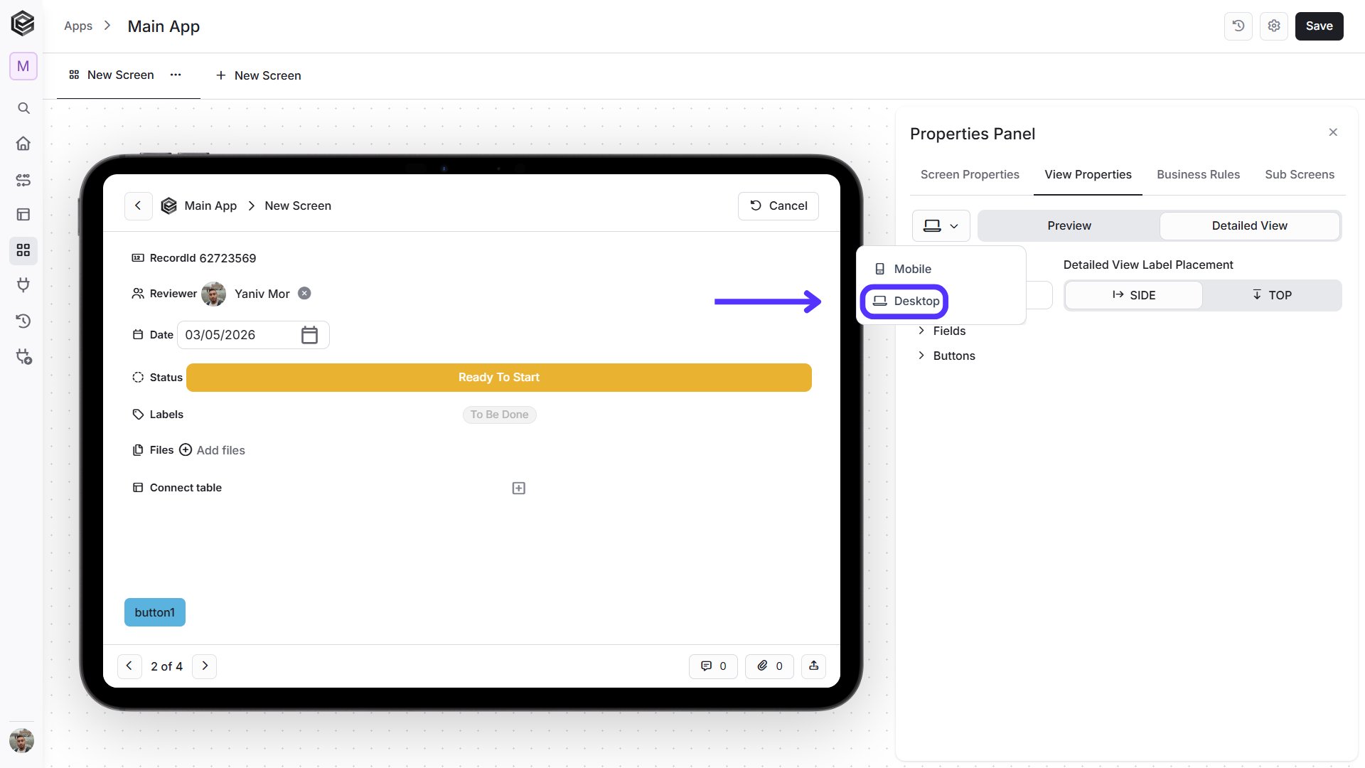 The Desktop Detailed View uses the same main settings as Mobile, with additional layout controls when available, such as the number of columns used to arrange the displayed fields.
 1. *Number of Columns -* Defines how many columns are used to arrange the fields in the Desktop Detailed View. You can configure up to **12 columns**.
2. *Detailed View Label Placement -* Defines whether field labels appear beside their values or above them.
• *Side -* The default option. Displays the field label beside its value.
1. *Number of Columns -* Defines how many columns are used to arrange the fields in the Desktop Detailed View. You can configure up to **12 columns**.
2. *Detailed View Label Placement -* Defines whether field labels appear beside their values or above them.
• *Side -* The default option. Displays the field label beside its value.
 • *Top -* Displays the field label above its value.
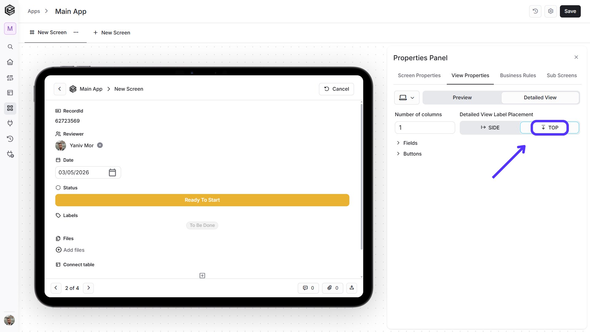 3. *Fields -* Controls which fields are displayed in the Detailed View and how they are arranged across the desktop layout.
 1. *Shown in app -* Displays the fields that are currently visible in the Detailed View.
2. *Row -* Defines the row position of the field in the desktop layout.
3. *Col -* Defines the column position of the field. The available positions depend on the configured **Number of Columns**.
4. *Hide all -* Hides all fields currently shown in the Detailed View.
5. *Required -* Marks the field as required before the record can be saved.
6. *Editable -* Allows users to edit the field value in the Detailed View.
7. *Add / Input -* Allows users to add or enter a value for the field.
8. *Visibility -* Click the eye icon to hide the selected field from the Detailed View.
9. *Hidden in app -* Displays fields that are currently hidden.
10. *Show all -* Makes all hidden fields visible again.
11. *Hidden field visibility -* Indicates that the field is hidden. Click the icon to make it visible again.
4. *Buttons -* Controls which configured buttons are displayed in the Detailed View and where they appear.
1. *Shown in app -* Displays the fields that are currently visible in the Detailed View.
2. *Row -* Defines the row position of the field in the desktop layout.
3. *Col -* Defines the column position of the field. The available positions depend on the configured **Number of Columns**.
4. *Hide all -* Hides all fields currently shown in the Detailed View.
5. *Required -* Marks the field as required before the record can be saved.
6. *Editable -* Allows users to edit the field value in the Detailed View.
7. *Add / Input -* Allows users to add or enter a value for the field.
8. *Visibility -* Click the eye icon to hide the selected field from the Detailed View.
9. *Hidden in app -* Displays fields that are currently hidden.
10. *Show all -* Makes all hidden fields visible again.
11. *Hidden field visibility -* Indicates that the field is hidden. Click the icon to make it visible again.
4. *Buttons -* Controls which configured buttons are displayed in the Detailed View and where they appear.
 1. *Drag and Drop -* Drag a button to change its position in the Detailed View.
2. *Visibility -* Click the eye icon to show or hide the selected button in the Detailed View.
## Sub Screens
Sub screens let you connect screens within your app smoothly. This means you can easily add one screen inside another, making a connected user experience.
1. *Drag and Drop -* Drag a button to change its position in the Detailed View.
2. *Visibility -* Click the eye icon to show or hide the selected button in the Detailed View.
## Sub Screens
Sub screens let you connect screens within your app smoothly. This means you can easily add one screen inside another, making a connected user experience.
 ### Add a Sub Screen
To add a Sub Screen, open the **Sub Screens** tab in the Properties Panel
### Add a Sub Screen
To add a Sub Screen, open the **Sub Screens** tab in the Properties Panel
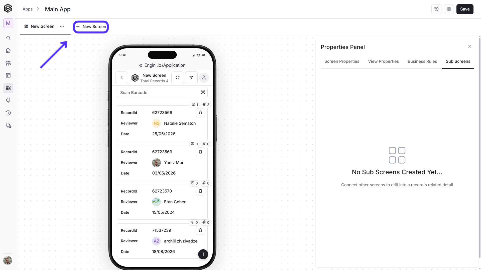 and click **Add Sub Screen**. This allows you to connect another existing screen to the current screen and display related information within the same app flow.
 ### Configure a Sub Screen
After adding a Sub Screen, you can configure its settings, such as which screen should be used and the order in which it is displayed.
### Configure a Sub Screen
After adding a Sub Screen, you can configure its settings, such as which screen should be used and the order in which it is displayed.
 1. *Connect Screen -* Select the existing screen you want to connect as a Sub Screen.
2. *Display in Main Form -* Enable this option to display the connected Sub Screen directly within the main form.
3. *Conditions -* Define the conditions that determine when or for which records the Sub Screen should be displayed or connected.
1. *Connect Screen -* Select the existing screen you want to connect as a Sub Screen.
2. *Display in Main Form -* Enable this option to display the connected Sub Screen directly within the main form.
3. *Conditions -* Define the conditions that determine when or for which records the Sub Screen should be displayed or connected.
 1. *Field -* Select the field that should be evaluated.
2. *Condition -* Select the comparison operator, such as **Is Equal**, **Is Not Equal**, **Contains**, and other available options.
3. *Value -* Enter or map the value that should be compared against the selected field.
4. *Add Condition -* Adds another condition to further control when the Sub Screen should be used.
In this example, the condition checks whether **RecordId Is Equal to 67461703**. This means the Sub Screen will be connected or displayed only when the current record's **RecordId** matches that value.
1. *Field -* Select the field that should be evaluated.
2. *Condition -* Select the comparison operator, such as **Is Equal**, **Is Not Equal**, **Contains**, and other available options.
3. *Value -* Enter or map the value that should be compared against the selected field.
4. *Add Condition -* Adds another condition to further control when the Sub Screen should be used.
In this example, the condition checks whether **RecordId Is Equal to 67461703**. This means the Sub Screen will be connected or displayed only when the current record's **RecordId** matches that value.
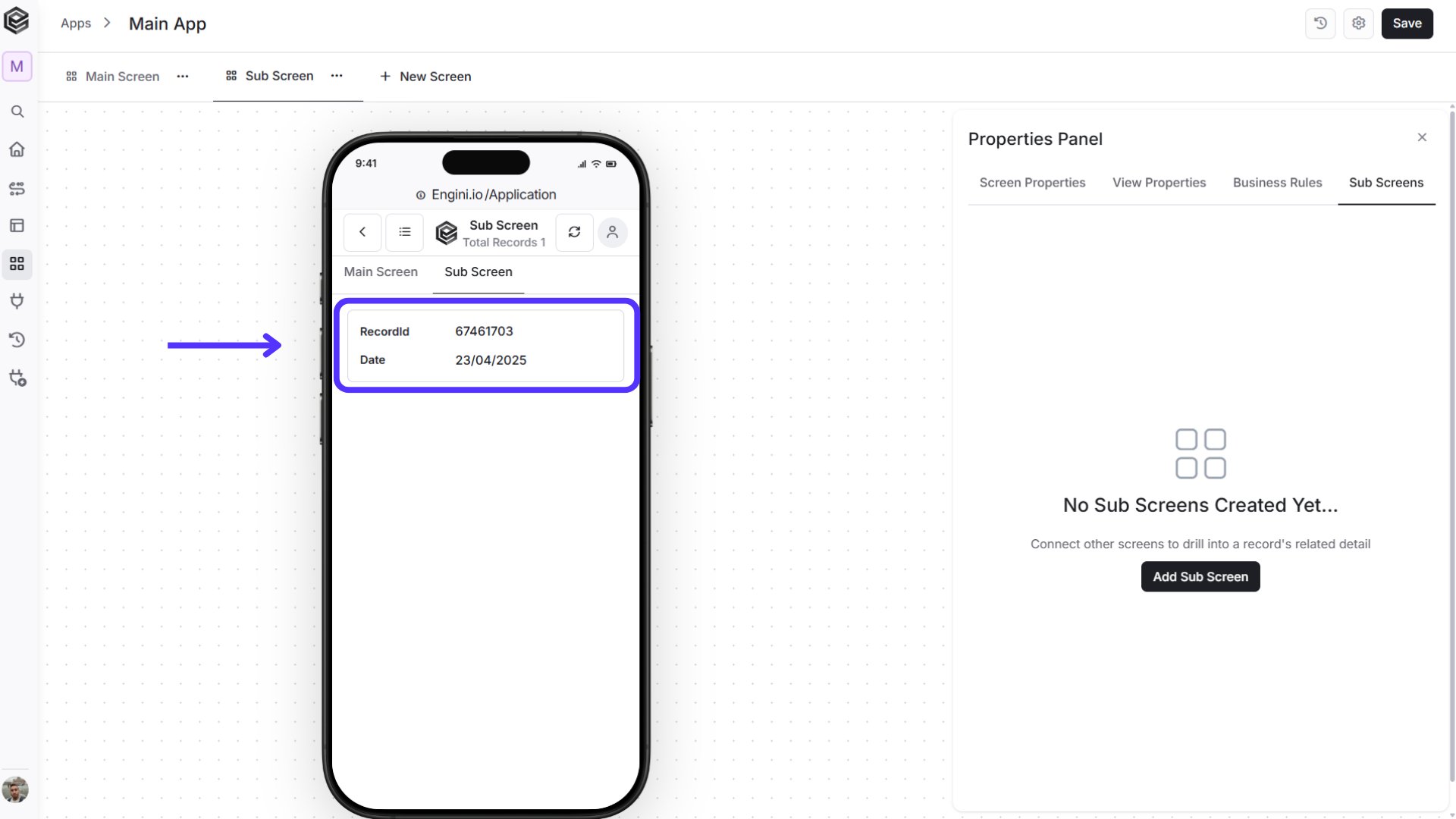 4. *Default Values -* Define values that should be automatically passed or populated when the Sub Screen is opened or used.
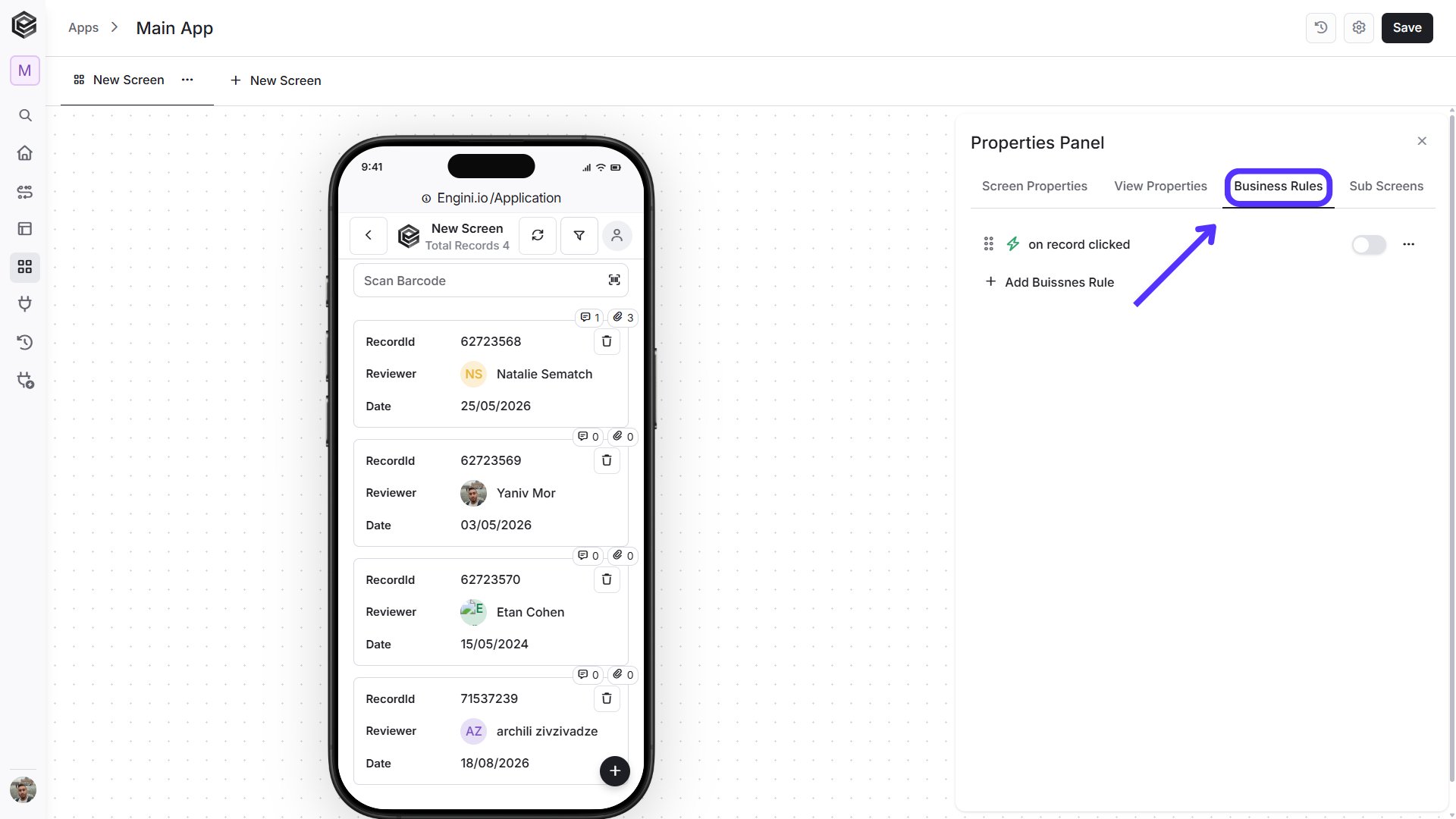
## Business Rules
As we finish looking at Screen Properties, we step into Business Rules.
To learn more about using Business Rules as part of your app, check out the link.
4. *Default Values -* Define values that should be automatically passed or populated when the Sub Screen is opened or used.
## Business Rules
As we finish looking at Screen Properties, we step into Business Rules.
To learn more about using Business Rules as part of your app, check out the link.
 1. *Field -* Select the field in the Sub Screen that should receive a default value.
2. *Default Value -* Define the value that should be assigned automatically to the selected field.
3. *Add Default Value -* Adds another field and default value mapping.
This documentation is built and hosted on [Mintlify](https://mintlify.com), a developer documentation platform.
1. *Field -* Select the field in the Sub Screen that should receive a default value.
2. *Default Value -* Define the value that should be assigned automatically to the selected field.
3. *Add Default Value -* Adds another field and default value mapping.
This documentation is built and hosted on [Mintlify](https://mintlify.com), a developer documentation platform.